

Benefits
Specifications
How-to
Contact Us
Learn More


VoucherCart
Brand Platform
A comprehensive design system that empowers teams to create consistent, accessible, and beautiful user experiences across all VoucherCart products.
Logo Use
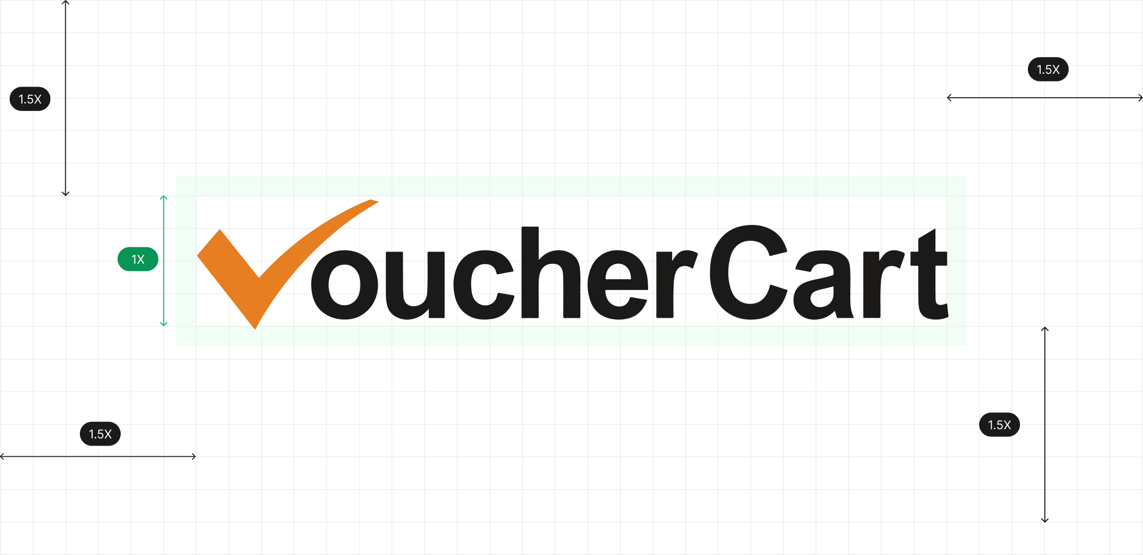
VoucherCart Logo Usage Guidelines
The VoucherCart logo must always be displayed clearly and consistently across all applications. To maintain brand integrity, the following rules apply:
- Clear Space
- A minimum clear space equal to 1.5 times the height of the “V” check mark must be maintained around all sides of the logo.This ensures the logo is never crowded by text, graphics, or other elements.
- Scaling & Proportions
- The logo should always be scaled proportionally; stretching, compressing, or altering its shape is not permitted.
- Minimum size for print: 25mm width.
- Minimum size for digital: 120px width.
- Colour Usage
- The check mark must always appear in brand orange (#E67E22).
- The word “VoucherCart” must remain in ark black (#1B1A19).
- Do not apply gradients, shadows, or recolouring to the logo.
- Background Control
- The logo should appear on a clean, uncluttered background.
- Use the logo in full colour on white or light backgrounds.
- On dark backgrounds, use the white or reversed version of the logo.
- Incorrect Usage
- Do not rotate, tilt, or crop the logo.
- Do not place the logo on busy or patterned backgrounds.
- Do not change the typeface, colour, or proportions of the check mark and text.


Standard Dark
This logo is for use on a light background.
#FFFFFF

Standard Light
This logo is for use on a dark background.
#1B1A19

Full White
Only to be used to ensure tick is visible when corporate orange is used as a background.
#E67E22
Download the Logo
Primary colour
A comprehensive design system that empowers teams to create consistent, accessible, and beautiful user experiences across all VoucherCart products.
Brand
The brand color is your "primary" color, and is used across all interactive elements such as buttons, links, inputs, etc. This color can define the overall feel and can elicit emotion.
#FFF8F0
#FFEEDC
#FFE0BE
#FFC78F
#F8B974
#F39C3F

#E67E22
#C76D1C
#A55A17
#834613
#5E320E
#3A1D07
Error
Error colors are used across error states and in "destructive" actions. They communicate a destructive/negative action, such as removing a user from your team.
#FBEAEA
#F6D5D5
F1B8B8
#E99595
#E27272
#DB4E4E
#D42B2B
#B12424
#8D1D1D
#6A1616
#470E0E
#2A0909
Warning
Warning colors can communicate that an action is potentially destructive or "on-hold". These colors are commonly used in confirmations to grab the users' attention.
#FCF7E8
#FAF0D7
#F7E7BC
#F3DA9A
#F0CE79
#ECC258
#E8B636
#C1982D
#9B7924
#745B1B
#4D3D12
#2E240B
Success
Success colors communicate a positive action, positive trend, or a successful confirmation. If you're using green as your primary color, it can be helpful to introduce a different hue for your success green.
#F6FEF9
#ECFDF3
#DCFAE6
#ABEFC6
#75E0A7
#47CD89
#17B26A
#079455
#067647
#085D3A
#074D31
#053321
Secondary colours
A comprehensive design system that empowers teams to create consistent, accessible, and beautiful user experiences across all VoucherCart products.
Gray blue
Can be swapped with the default gray color.
#FCFCFD
#F8F9FC
#EAECF5
#D5D9EB
#B3B8DB
#717BBC
#4E5BA6
#3E4784
#363F72
#293056
#101323
#0D0F1C
Gray cool
Can be swapped with the default gray color.
#FCFCFD
#F9F9FB
#EFF1F5
#DCDFEA
#B9C0D4
#7D89B0
#5D6B98
#4A5578
#404968
#30374F
#111322
#0E101B
Gray warm
Can be swapped with the default neutral color.
#FDFDFC
#FAFAF9
#F5F5F4
#E7E5E4
#D7D3D0
#A9A29D
#79716B
#57534E
#44403C
#292524
#1C1917
#171412
Gradients
A gradient is the gradual blending from one color to another. Incorporating gradients into your designs is a great way to make objects stand out by adding a new dimension and adding realism to objects. They almost create a new color. These mesh gradients are created in Mesh, a beautiful gradient creator by Burak Aslan.
Gray gradients
Gray is a neutral color and is the foundation of the color system. Neutral linear gradients are useful for backgrounds and adding subtle depth and texture to designs.
600
#535862
90deg
500
#717680

700
#414651
45deg
600
#535862

800
#252B37
45deg
600
#535862

800
#252B37
90deg
600
#535862

800
#252B37
26.5deg
700
#414651

900
#181D27
45deg
600
#535862

900
#181D27
45deg
700
#414651

50
#FAFAFA
180deg
white
#FFFFFF

100
#F5F5F5
180deg
white
#FFFFFF

100
#F5F5F5
180deg
25
#FDFDFD

100
#F5F5F5
180deg
50
#FAFAFA

200
#E9EAEB
180deg
25
#FDFDFD

200
#E9EAEB
180deg
50
#FAFAFA

200
#E9EAEB
180deg
100
#F5F5F5

Brand gradients
The brand color is your "primary" color, and is used across all interactive elements such as buttons, links, inputs, etc. This color can define the overall feel and can elicit emotion.
Error
Error colors are used across error states and in "destructive" actions. They communicate a destructive/negative action, such as removing a user from your team.
600
#7F56D9
90deg
500
#9E77ED

700
#6941C6
45deg
600
#7F56D9

800
#53389E
45deg
600
#7F56D9

800
#53389E
90deg
600
#7F56D9

800
#53389E
26.5deg
700
#6941C6

900
#42307D
45deg
600
#7F56D9

900
#42307D
45deg
700
#6941C6

Typography
Our design system leverages a purposeful set of typographic styles. We’ve stress-tested this typographic scale across dozens of projects to make sure it’s robust enough to use across (almost) any project, while remaining as accessible as possible for everyone.
Inter
Ag
ABCDEFGHIJKLMNOPQRSTUVWXYZabcdefghijklmnopqrstuvwxyz0123456789 !@#$%^&*()
Display 2xl
Font size: 72px / 4.5rem | Line height: 90px / 5.625rem | Letter spacing: -2%
Display 2xl
Regular
Display 2xl
Medium
Display 2xl
Semibold
Display 2xl
Bold
Display xl
Font size: 60px / 3.75rem | Line height: 72px / 4.5rem | Letter spacing: -2%
Display xl
Regular
Display xl
Medium
Display xl
Semibold
Display xl
Bold
Display lg
Font size: 48px / 3rem | Line height: 60px / 3.75rem | Letter spacing: -2%
Display lg
Regular
Display lg
Medium
Display lg
Semibold
Display lg
Bold
Display md
Font size: 36px / 2.25rem | Line height: 44px / 2.75rem | Letter spacing: -2%
Display md
Regular
Display md
Medium
Display md
Semibold
Display md
Bold
Display sm
Font size: 30px / 1.875rem | Line height: 38px / 2.375rem
Display sm
Regular
Display sm
Medium
Display sm
Semibold
Display sm
Bold
Display xs
Font size: 24px / 1.5rem | Line height: 32px / 2rem
Display xs
Regular
Display xs
Medium
Display xs
Semibold
Display xs
Bold
Text xl
Font size: 20px / 1.25rem | Line height: 30px / 1.875rem
Text xl
Regular
Text xl
Medium
Text xl
Semibold
Text xl
Bold
Text lg
Font size: 18px / 1.125rem | Line height: 28px / 1.75rem
Text lg
Regular
Text lg
Medium
Text lg
Semibold
Text lg
Bold
Text md
Font size: 16px / 1rem | Line height: 24px / 1.5rem
Text md
Regular
Text md
Medium
Text md
Semibold
Text md
Bold
Text sm
Font size: 14px / 0.875rem | Line height: 20px / 1.25rem
Text sm
Regular
Text sm
Medium
Text sm
Semibold
Text sm
Bold
Text xs
Font size: 12px / 0.75rem | Line height: 18px / 1.125rem
Text xs
Regular
Text xs
Medium
Text xs
Semibold
Text xs
Bold
Text xxs
Font size: 10px / 0.625rem | Line height: 15px / 0.9375rem
Text xxs
Regular
Text xxs
Medium
Text xxs
Semibold
Text xxs
Bold
Icons
VoucherCart are a beautiful, consistent, and neutral icon library crafted specifically for modern UI design. Made for Figma, in Figma. Each icon is designed on a 24x24 grid with an emphasis on simplicity, consistency, and readability. VoucherCart Icons are designed to respect Figma component colour and stoke overrides, like magic. Preview 4,600+ icons with duo colour and duotone styles at untitledui.com/icons.
General


Layout


Media & devices


Development


Finance & eCommerce


Maps & travel


Radius
Use border radius values to quickly style the border-radius of an element. Border radius values are useful for rounding edges of images, buttons, or any other element. Just like pre-defined spacing values, working from a defined border radius system allows you to work faster and more consistently.
radius-none
radius-xxs
radius-xs
radius-sm
radius-md
radius-lg
radius-xl
radius-2xl
radius-3xl
radius-4xl
Radius
Variables
Working from a pre-defined and limited radius system for adding border radiuses (or radii) to elements allows you to work faster and consistently. Untitled UI uses a pre-defined and limited radius system derived from the primitive spacing values.
Name
radius-none
radius-xxs
radius-xs
radius-sm
radius-md
radius-lg
radius-xl
radius-2xl
radius-3xl
radius-4xl
radius-full
Size (16px base)
0rem
0.125rem
0.25rem
0.375rem
0.5rem
0.625rem
0.75rem
1rem
1.25rem
1.5rem
∞
Pixels
0px
2px
4px
6px
8px
10px
12px
16px
20px
24px
9999px
Radius
Effect styles
Shadows allow you to add depth and realism to designs by positioning elements on a z-axis.
A focus ring (also known as a "focus indicator") identifies the currently focused element on your page.
Backdrop blurs (or background blurs) are often used stylistically in modern UI design. However, just like shadows, they allow you to add depth and realism to designs by positioning elements on a z-axis.
shadow-xs
shadow-sm
shadow-md
shadow-lg
shadow-xl
shadow-2xl
shadow-3xl
Benefits
Specifications
How-to
Contact Us
Learn More

VoucherCart
Brand Platform
A comprehensive design system that empowers teams to create consistent, accessible, and beautiful user experiences across all VoucherCart products.
Logo Use
VoucherCart Logo Usage Guidelines
The VoucherCart logo must always be displayed clearly and consistently across all applications. To maintain brand integrity, the following rules apply:
- Clear Space
- A minimum clear space equal to 1.5 times the height of the “V” check mark must be maintained around all sides of the logo.This ensures the logo is never crowded by text, graphics, or other elements.
- Scaling & Proportions
- The logo should always be scaled proportionally; stretching, compressing, or altering its shape is not permitted.
- Minimum size for print: 25mm width.
- Minimum size for digital: 120px width.
- Colour Usage
- The check mark must always appear in brand orange (#E67E22).
- The word “VoucherCart” must remain in ark black (#1B1A19).
- Do not apply gradients, shadows, or recolouring to the logo.
- Background Control
- The logo should appear on a clean, uncluttered background.
- Use the logo in full colour on white or light backgrounds.
- On dark backgrounds, use the white or reversed version of the logo.
- Incorrect Usage
- Do not rotate, tilt, or crop the logo.
- Do not place the logo on busy or patterned backgrounds.
- Do not change the typeface, colour, or proportions of the check mark and text.

Standard Dark
This logo is for use on a light background.
#FFFFFF
Standard Light
This logo is for use on a dark background.
#1B1A19
Full White
Only to be used to ensure tick is visible when corporate orange is used as a background.
#E67E22
Download the Logo
Primary colour
A comprehensive design system that empowers teams to create consistent, accessible, and beautiful user experiences across all VoucherCart products.
Brand
The brand color is your "primary" color, and is used across all interactive elements such as buttons, links, inputs, etc. This color can define the overall feel and can elicit emotion.
#FFF8F0
#FFEEDC
#FFE0BE
#FFC78F
#F8B974
#F39C3F
#E67E22
#C76D1C
#A55A17
#834613
#5E320E
#3A1D07
Error
Error colors are used across error states and in "destructive" actions. They communicate a destructive/negative action, such as removing a user from your team.
#FBEAEA
#F6D5D5
F1B8B8
#E99595
#E27272
#DB4E4E
#D42B2B
#B12424
#8D1D1D
#6A1616
#470E0E
#2A0909
Warning
Warning colors can communicate that an action is potentially destructive or "on-hold". These colors are commonly used in confirmations to grab the users' attention.
#FCF7E8
#FAF0D7
#F7E7BC
#F3DA9A
#F0CE79
#ECC258
#E8B636
#C1982D
#9B7924
#745B1B
#4D3D12
#2E240B
Success
Success colors communicate a positive action, positive trend, or a successful confirmation. If you're using green as your primary color, it can be helpful to introduce a different hue for your success green.
#F6FEF9
#ECFDF3
#DCFAE6
#ABEFC6
#75E0A7
#47CD89
#17B26A
#079455
#067647
#085D3A
#074D31
#053321
Secondary colours
A comprehensive design system that empowers teams to create consistent, accessible, and beautiful user experiences across all VoucherCart products.
Gray blue
Can be swapped with the default gray color.
#FCFCFD
#F8F9FC
#EAECF5
#D5D9EB
#B3B8DB
#717BBC
#4E5BA6
#3E4784
#363F72
#293056
#101323
#0D0F1C
Gray cool
Can be swapped with the default gray color.
#FCFCFD
#F9F9FB
#EFF1F5
#DCDFEA
#B9C0D4
#7D89B0
#5D6B98
#4A5578
#404968
#30374F
#111322
#0E101B
Gray warm
Can be swapped with the default neutral color.
#FDFDFC
#FAFAF9
#F5F5F4
#E7E5E4
#D7D3D0
#A9A29D
#79716B
#57534E
#44403C
#292524
#1C1917
#171412
Gradients
A gradient is the gradual blending from one color to another. Incorporating gradients into your designs is a great way to make objects stand out by adding a new dimension and adding realism to objects. They almost create a new color. These mesh gradients are created in Mesh, a beautiful gradient creator by Burak Aslan.
Gray gradients
Gray is a neutral color and is the foundation of the color system. Neutral linear gradients are useful for backgrounds and adding subtle depth and texture to designs.
600
#535862
90deg
500
#717680
700
#414651
45deg
600
#535862
800
#252B37
45deg
600
#535862
800
#252B37
90deg
600
#535862
800
#252B37
26.5deg
700
#414651
900
#181D27
45deg
600
#535862
900
#181D27
45deg
700
#414651
50
#FAFAFA
180deg
white
#FFFFFF
100
#F5F5F5
180deg
white
#FFFFFF
100
#F5F5F5
180deg
25
#FDFDFD
100
#F5F5F5
180deg
50
#FAFAFA
200
#E9EAEB
180deg
25
#FDFDFD
200
#E9EAEB
180deg
50
#FAFAFA
200
#E9EAEB
180deg
100
#F5F5F5
Brand gradients
The brand color is your "primary" color, and is used across all interactive elements such as buttons, links, inputs, etc. This color can define the overall feel and can elicit emotion.
Error
Error colors are used across error states and in "destructive" actions. They communicate a destructive/negative action, such as removing a user from your team.
600
#7F56D9
90deg
500
#9E77ED
700
#6941C6
45deg
600
#7F56D9
800
#53389E
45deg
600
#7F56D9
800
#53389E
90deg
600
#7F56D9
800
#53389E
26.5deg
700
#6941C6
900
#42307D
45deg
600
#7F56D9
900
#42307D
45deg
700
#6941C6
Typography
Our design system leverages a purposeful set of typographic styles. We’ve stress-tested this typographic scale across dozens of projects to make sure it’s robust enough to use across (almost) any project, while remaining as accessible as possible for everyone.
Inter
Ag
ABCDEFGHIJKLMNOPQRSTUVWXYZabcdefghijklmnopqrstuvwxyz0123456789 !@#$%^&*()
Display 2xl
Font size: 72px / 4.5rem | Line height: 90px / 5.625rem | Letter spacing: -2%
Display 2xl
Regular
Display 2xl
Medium
Display 2xl
Semibold
Display 2xl
Bold
Display xl
Font size: 60px / 3.75rem | Line height: 72px / 4.5rem | Letter spacing: -2%
Display xl
Regular
Display xl
Medium
Display xl
Semibold
Display xl
Bold
Display lg
Font size: 48px / 3rem | Line height: 60px / 3.75rem | Letter spacing: -2%
Display lg
Regular
Display lg
Medium
Display lg
Semibold
Display lg
Bold
Display md
Font size: 36px / 2.25rem | Line height: 44px / 2.75rem | Letter spacing: -2%
Display md
Regular
Display md
Medium
Display md
Semibold
Display md
Bold
Display sm
Font size: 30px / 1.875rem | Line height: 38px / 2.375rem
Display sm
Regular
Display sm
Medium
Display sm
Semibold
Display sm
Bold
Display xs
Font size: 24px / 1.5rem | Line height: 32px / 2rem
Display xs
Regular
Display xs
Medium
Display xs
Semibold
Display xs
Bold
Text xl
Font size: 20px / 1.25rem | Line height: 30px / 1.875rem
Text xl
Regular
Text xl
Medium
Text xl
Semibold
Text xl
Bold
Text lg
Font size: 18px / 1.125rem | Line height: 28px / 1.75rem
Text lg
Regular
Text lg
Medium
Text lg
Semibold
Text lg
Bold
Text md
Font size: 16px / 1rem | Line height: 24px / 1.5rem
Text md
Regular
Text md
Medium
Text md
Semibold
Text md
Bold
Text sm
Font size: 14px / 0.875rem | Line height: 20px / 1.25rem
Text sm
Regular
Text sm
Medium
Text sm
Semibold
Text sm
Bold
Text xs
Font size: 12px / 0.75rem | Line height: 18px / 1.125rem
Text xs
Regular
Text xs
Medium
Text xs
Semibold
Text xs
Bold
Text xxs
Font size: 10px / 0.625rem | Line height: 15px / 0.9375rem
Text xxs
Regular
Text xxs
Medium
Text xxs
Semibold
Text xxs
Bold
Icons
VoucherCart are a beautiful, consistent, and neutral icon library crafted specifically for modern UI design. Made for Figma, in Figma. Each icon is designed on a 24x24 grid with an emphasis on simplicity, consistency, and readability. VoucherCart Icons are designed to respect Figma component colour and stoke overrides, like magic. Preview 4,600+ icons with duo colour and duotone styles at untitledui.com/icons.
General
Layout
Media & devices
Development
Finance & eCommerce
Maps & travel
Radius
Use border radius values to quickly style the border-radius of an element. Border radius values are useful for rounding edges of images, buttons, or any other element. Just like pre-defined spacing values, working from a defined border radius system allows you to work faster and more consistently.
radius-none
radius-xxs
radius-xs
radius-sm
radius-md
radius-lg
radius-xl
radius-2xl
radius-3xl
radius-4xl
Radius
Variables
Working from a pre-defined and limited radius system for adding border radiuses (or radii) to elements allows you to work faster and consistently. Untitled UI uses a pre-defined and limited radius system derived from the primitive spacing values.
Name
radius-none
radius-xxs
radius-xs
radius-sm
radius-md
radius-lg
radius-xl
radius-2xl
radius-3xl
radius-4xl
radius-full
Size (16px base)
0rem
0.125rem
0.25rem
0.375rem
0.5rem
0.625rem
0.75rem
1rem
1.25rem
1.5rem
∞
Pixels
0px
2px
4px
6px
8px
10px
12px
16px
20px
24px
9999px
Radius
Effect styles
Shadows allow you to add depth and realism to designs by positioning elements on a z-axis.
A focus ring (also known as a "focus indicator") identifies the currently focused element on your page.
Backdrop blurs (or background blurs) are often used stylistically in modern UI design. However, just like shadows, they allow you to add depth and realism to designs by positioning elements on a z-axis.
shadow-xs
shadow-sm
shadow-md
shadow-lg
shadow-xl
shadow-2xl
shadow-3xl